


How ESB Ruined Integration Diagrams
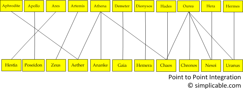
posted by Anna Mar, July 28, 2011Before Enterprise Service Bus (ESB) came along integration diagrams were generally point to point. Point to point diagrams are messy and terrible — but at least they provide valuable information.
Where ESB Integration Diagrams Go Wrong
These days, integration diagrams often look like this:
The problem with this diagram is that data flow information is not captured. The diagram captures the fact that a bunch of systems talk to a bunch of systems — and that's about it.
A Better Alternative
The following diagram captures the flow of information and frequency of transfer.
Real life diagrams rarely line up as well as in this example. In fact, if you try to represent more than 20 integrations — the diagram often comes out looking like spaghetti. A integration chart is often preferable to a diagram.


|
Learn about the 10 most important patterns for SOA success. |

|
A large collection of enterprise architecture tools. |

|
Imagine your hardcore IT geek talking to a company executive. What would they talk about? |

|
Don't worry about people stealing your ideas. If your ideas are any good, you'll have to ram them down people's throats.
~ Howard Aiken |
Recently on Simplicable

|

| Cloud Guideposted by John SpaceyA guide to cloud computing including cheat sheets, best practices and metrics. |

| Web Security: Battleships and Locustsposted by Anna MarThere are two types of web security threats: battleships and locusts. |

| Web Security Illustratedposted by John SpaceyHow would you explain web security to your grandmother? |
