Minimalism
As in other design areas, there is a significant and pervasive tendency in user interface design toward minimalism. In many cases, designers will adopt minimalism as a principle without thought to context. For example, designs may display only a few lines of text per page even when it is clear that most customers would prefer to see more information.Culture
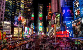
Information density preferences are related to culture. American designs tend towards minimalism with large fonts and elements. In comparison, Japanese designs are commonly packed with information with small text, images and little spacing.Books
Users tend to be most comfortable with information density and formatting that is similar to a book. A novel commonly has 150 - 350 words per page with generous fonts, margins and line spacing. A similar style is commonly adopted by electronic documents and user interfaces.Productivity
It is common for users to prefer highly dense productivity tools. An employee who has to review 100 customer applications per week may be less efficient if applications are displayed in 30 pages as opposed to one. Likewise, executives and managers often prefer packed dashboards with extremely high information density as opposed to 50 page reports.Human Error
Information density has implications for human error and safety engineering. For example, a critical and urgent warning that takes up an entire screen is likely to be noticed as compared to a little blinking light.Accessibility
Large text and big buttons tend to be more accessible.Communication
Low density information tends to highlight an important point. High density information communicates information more efficiently, as long as it's readable. Medium information density similar to the formatting of a typical novel is comfortable and encourages users to read.| Overview: Information Density | ||
Type | ||
Definition | The amount of human-readable information in a square inch of a user interface or information source. | |
Related Concepts | ||


