
Positive Kerning
Letter combinations that have an increased space between them. This can be implemented by typographers to put a larger space than default between letter combinations that look distracting too close together. For example, letter combinations that curve towards each other. This is typically implemented with a kerning table.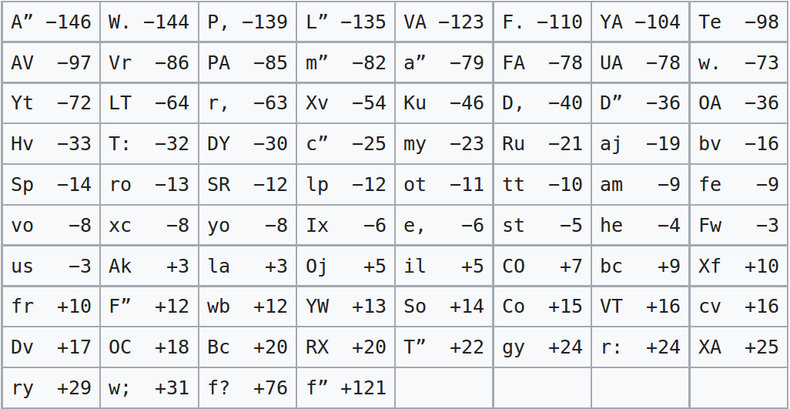
Negative Kerning
Letter combinations that have a decreased space between them. This includes the possibility of overlap. Negative kerning is more common than positive kerning.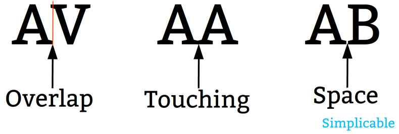
Contextual Kerning
Kerning that goes beyond two letter combinations to consider how the spacing looks for three letters or more. Fonts don't typically support this but it does impact typographic quality. As such, graphic designers may simulate contextual kerning by manually setting parameters such as tracking.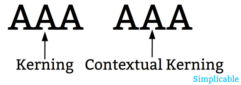
Automatic
Kerning is often a feature of a font that is configured by a typographer. It is also possible for kerning to be an automated feature of software such as an office productivity tool.| Overview: Kerning | ||
Type | ||
Definition | Variable spacing between combinations of letters designed to make spaces look visually similar. | |
Related Concepts | ||